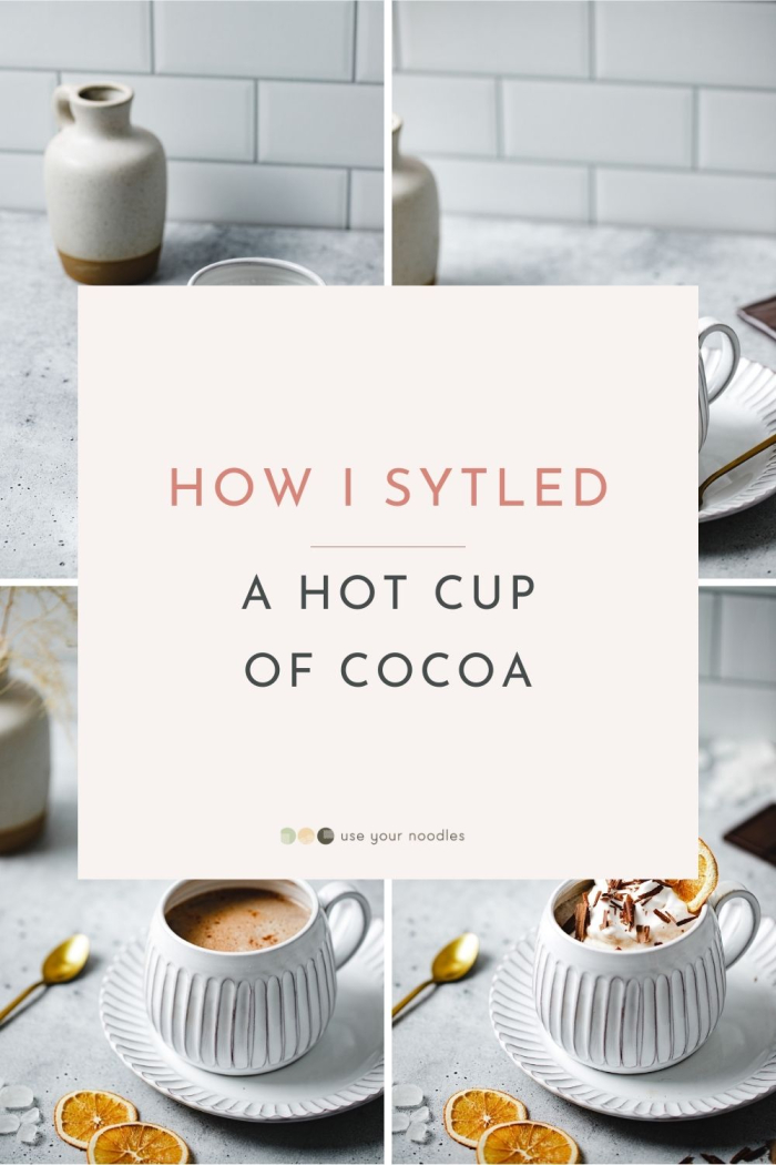
How I styled this – Hot Cocoa
Take a look at how I styled a cup of hot cocoa. From how I created the composition to how I faked the cream!

Welcome to this tutorial on I how I styled this photo of hot cocoa.
Even though the composition seems relatively simple, there were things to consider to make it appear light and bright. So keep on reading to find more.
Or, if you prefer to watch, you can watch the video below.
Starting Point and Inspiration
This was a photo from a recent photoshoot for the article How To Use Negative Space In Food Photography.
The idea was that I needed some negative space. However, I also wanted to include some visually interesting elements to fill out the space.
I wanted the photo to be flowy and dynamic without being overly full and crammed with props.
How I Styled This
I placed the tiled backdrop in the back at an angle to add some dynamics to the photo. (left photo below)
Then I started playing with how they are positioned in relation to each other. (right photo below)
I preferred the focus to be on the mug, and that’s why I ended up placing the vase more to the side. I just didn’t want it to overshadow this beautiful mug, which would eventually hold cocoa.
By changing the placement of the camera bit I was able to get more space at the top. This is a technique I love to use for brighter, whiter photos to give them that extra breathing space.
Then I started placing different elements around, starting with a little bit of color, which kind of gave me a clue of what the colors were gonna be like. To get that really nice cold and warm contrast, I went with the orange in contrast with the blueish whites. I love blues with brown foods because they bring the warmth out of the browns.
While the orange color from the dried oranges adds that extra color punch, a color emphasis.
The placement of the chocolate bar on the right balances out the darker bottom of the vase on the left.


Then I started playing with a spoon to make it appear more lived in, so I went with a golden one for an extra pop of color.
I tested different placements and ended up placing it on the other side so it caught just the right light. You can see how much more colorful it is when the light catches it. With the way I positioned it, I was able to get a similar hue to the oranges. I placed the spoon diagonally to add some dynamics to the frame.


Then I filled the vase to make the scene more realistic. I used the same colors, the brownish-orange, so it doesn’t distract and is just a nice complement, and added texture to the photo. (left photo below)
And then I decided the angle was too low, not giving enough space to showcase the cocoa (right photo below). If we compare the two angles (left and right photos below), you can see how we can see more of the inside of the mug, which you’ll see later works better.
Then I made the bottom dried orange more visible to really emphasize the orange color.


And you can see in the back how I also then moved the chocolate further out (change from the photo bottom left to bottom right). It’s a very dark element, so hiding it a bit makes the entire frame more balanced.
And I added some crystal sugar or candy sugar (photo bottom right), which not only adds to the texture but also gives a cozy wintery vibe.


I also added some crystal sugar in the back to balance things out. And played around with the positioning a bit so they are not too distracting (photos bottom left & right).


And then I added the cream. For this photo, I tested a styling trick, which I explained at the end of this article, so keep on reading!
As a finishing point, I wanted to add a little bit of texture on top, so I made some chocolate shavings. And sprinkled them over, and I also added a bit in the bottom corner.
And then the final touch, the dried orange slice in the cream. It’s that last interesting detail in a drink.


After the finishing touch – photo stacking. This is a technique we’ll discuss another time; I was able to get the entire drink pretty much in focus, with the background nicely blurred for a soft effect. So this is the final photo:

Styling trick – Using Shaving Cream
Instead of using whipping cream, I used shaving cream.
The reason I liked working with it is that it holds for much longer, and it is easier to shape and create nice swirls. If you want to take a look at exactly how I worked with it, check the video at the top of this article at 5:55.
Just be sure not to drink the cocoa afterward!
Hope you enjoyed this mini-tutorial about how I styled this lovely (but unedible) cup of cocoa.


")


As always, really well explaned Anja and the end result looks great!
Happy to hear that Helene! 🙂